EducationalUniversity of Sussex: graduation brochure
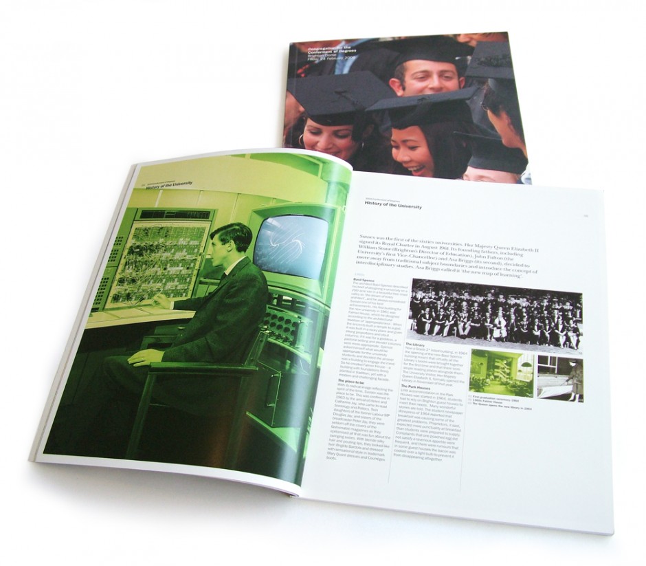
We convinced our client that just a long list of names and a University Crest was a waste of a marketing/fundraising opportunity. By then, the client had trust in our judgements and allowed us to devise a creative approach that included the history, aims, research and alumni. The size of the document was deliberately bigger than A4 on the principal that in restaurants ‘the better the restaurant the bigger the dimension of the menu’. It was a fantastic job to do. The world of Higher Education marketing, being what it is, meant that our approach had soon been copied by other universities.
Similar Projects
- EducationalBSMS Spring magazine 2018
- EducationalBSMS Pulse Autumn 2017
- EducationalBSMS Pulse magazine
- EducationalUniversity of Sussex publications


